Cyclingpeaks is a pretty cool piece of software. I’ve been using it to track my training progress since last November, and its taken until now for me to know where to look to see the trends in my data. Of all the graphs that show you what you’ve done, the most difficult to comprehend is the performance manager chart.
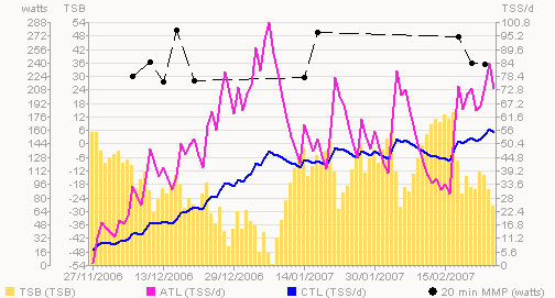
But now that I understand what I’m looking at, its certainly one of the most useful. This last week has seen me out a lot on the bike – I’ve turned out one of best Zone 3 watts/HR and hit my third best 20 minute mean maximal power this season. I was quite pleased, but by the weekend I had to admit that I was pretty tired. When I looked at the Performance Manager chart, I saw that my Chronic Training Load had gone up 13 points in the last 8 days, a 23% increase. So I don’t overcook things and get ill, I need to back off slightly to regain a bit of freshness and then look to build my CTL further through March before I start my speed work.
I’ve been inspired somewhat by the website of Dave Harris, another 24hr soloist from the US. Having just come back from injury, he finished 2nd behind Tinker at the Old Pueblo 24hr race. Besides having a wealth of really useful info on 24hr racing on his site, he’ll “be building CTL steadily until mid-spring when I’m back to the 120-140 levels where I prefer to be for ultra racing”. To some people its just numbers, but now that I’ve got my head around the PM chart, I reckon it’s pretty impressive.

Can you describe the chart somemore for “newbies”? Can I ask what are you seeing (e.g trends, interpritation)?
Guy, Give me a couple of days and I’ll put up an explanation for each of the elements.
cool, sorry to be a pain :o)